
Doca
Info
A bold visual identity for Doca, a document platform, built on a nostalgic dot-matrix typeface concept.
Year
2025
Client
Edenlab Development
Services
Brand identity · Social Media · Concept Creation
Live site
the design process
Challenge
Doca needed an identity that felt distinctive in a category full of safe, generic SaaS branding — something with character, not another clean blue logo.
Insight
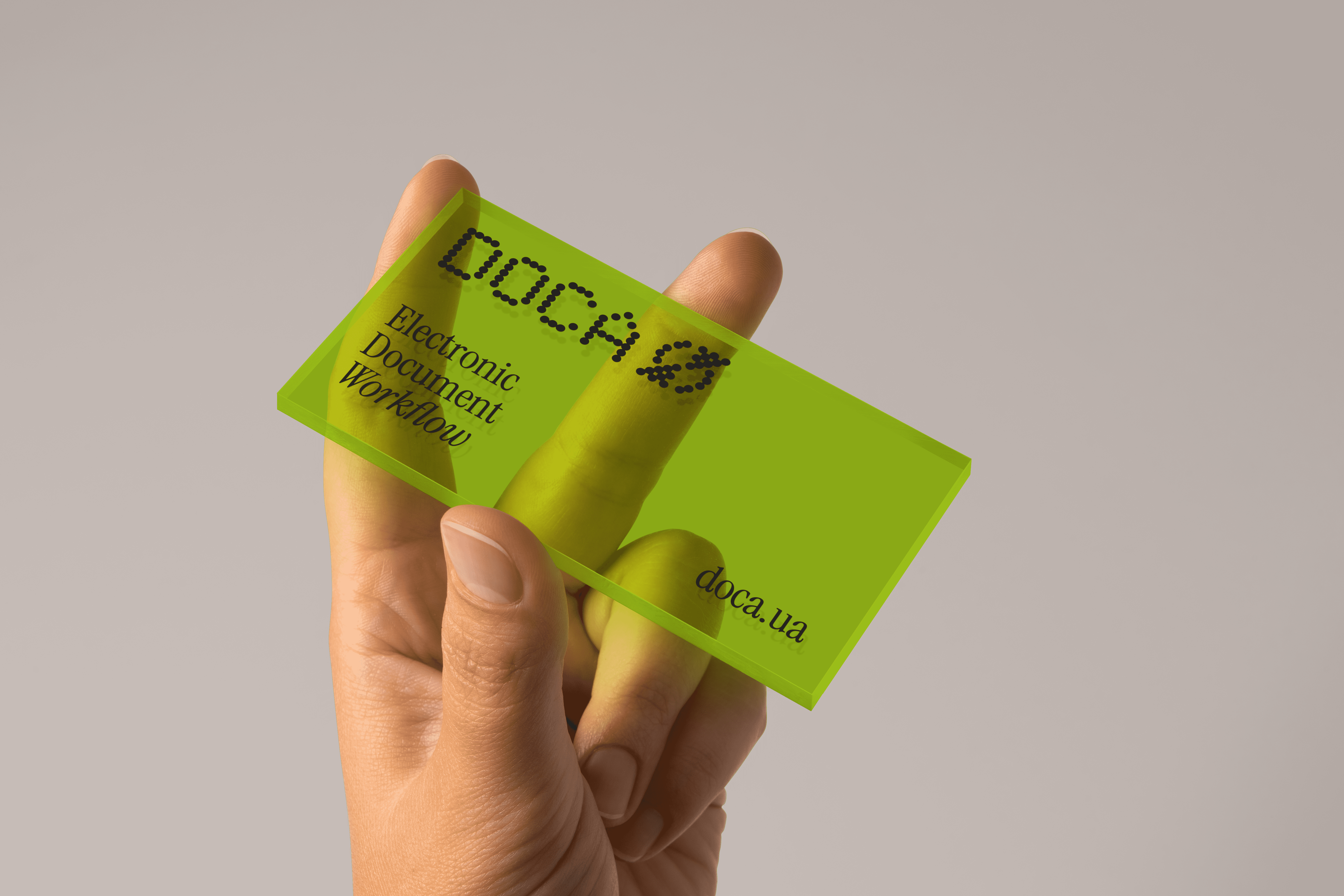
The product's core story is the move away from physical documents toward digital ones. That transition had a sound to it: the dot-matrix printer — familiar, a little nostalgic, instantly tied to the idea of "printed paper."
Answer
I built the identity around a printed, matrix-style typeface that carries that nostalgic note while pointing forward to the digital product. Alongside the bold dot-matrix direction the client chose, I built simpler, cleaner lockups so the mark stays legible at small sizes for dense layouts.



the design process
Outcome
The direction was approved by the client, but the project was paused before public launch when financing fell through. What's shown here is the concept stage — the approved creative direction, presented as a working draft rather than a shipped brand.
More works

